Where is the Value?
Investors always want to know what’s cheap—cheap relative to the opportunity set and relative to history. Cheapness could refer to any number of things—price relative to trailing twelve months earnings, to trailing earnings over multiple years, to analyst earnings estimates, to long-run projections, or a dozen other variations based on sales, cash flows, book value, etc.
Because analyst estimates tend to be tainted for a number of different reasons (see this discussion on why), we tend to focus on price relative to trailing twelve month sales, cash flows, and earnings to measure cheapness. This gives a more holistic and objective view of valuation.
Using this simple construct, we’ll give every investable stock across the globe a percentile valuation score from 1-100. Scores are then rolled up to countries and regions to get value scores for each relative to the entire global stock market. Our universe will be all stocks with a market cap greater than an inflation adjusted $1 billion (USD) and with reasonable daily liquidity from 1990-2018.*
Because developed and emerging markets are often treated differently, we’ll separate the two within each region. Some countries are such large portions of the overall global stock market that they warrant their own “region”, i.e. the U.S. and Japan.
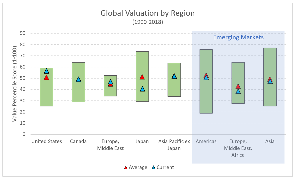
The chart below summarizes the results. Each green column represents a region/country. The vertical axis are the average percentile scores for each region/country discussed above. The top of each region column is the highest (most expensive) valuation since 1990, and the bottom is the lowest (cheapest). The red triangle represents the average valuation over the period, and the blue triangle represents current valuations.
As value investors, the most intriguing regions/countries are those with current valuations (blue triangle) below the historical average (red triangle) and low relative to the rest of the global market. Based on this chart, Japan and Emerging Europe, Middle East, Africa (EMEA) fall into this group. On the flip side, the U.S. stands out as being one of the most expensive markets relative to other regions and its own history. Given the massive run in the U.S. market over the last decade, this is no surprise.
Over the last several decades, it is common for there to be long cyclical trends of U.S. outperformance. Since the 1970’s at least, it has always reverted to form with non-U.S. markets outperforming for long stretches. Below is a chart of rolling 3 year returns for U.S. vs Foreign markets. At some point, the tide will change and foreign markets will have their day in the sun. Timing uncertain.
Regions give a decent overview but drilling down by countries within each region reveals some interesting stuff. Let’s turn first to the broadest region—EMEA. Obviously, Europe has been afflicted by several political events in the post Global Financial Crisis (GFC) era. Grexit, Brexit, questions on solvency in Italy, Spain, Portugal, etc. Setting all that aside, there are three countries that are trading reasonably below their historical averages and relative to others in the region—Portugal, Greece, and Turkey. These countries are not for the faint of heart, but then again, opportunities tend to require a contrarian bent form investors that can see through the noise.
Turning to the Asia Pacific region, there are a few standouts. For developed markets, Japan and Singapore are both trading well below their historical average and with discounted valuation relative to other countries. On the EM side, Russia is the clear winner—cheap relative to history and within the region. With high economic reliance on the Energy sector, a volatile currency, and a few political concerns, the valuation seems to make sense, but certainly worthy of a closer look.
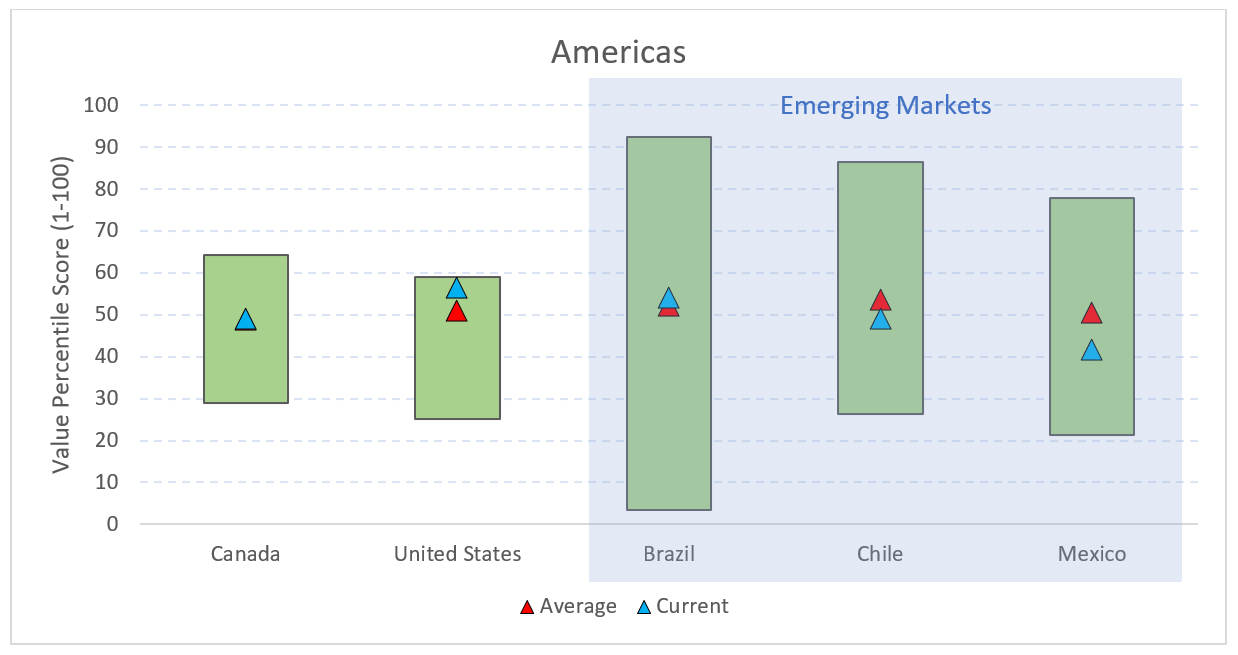
Turning to the Americas, as mentioned above the U.S. appears expensive relative to history and other countries/regions, but that has been the case for some time and could persist. Of interest on this side of the Atlantic is Mexico. A little ways into The Absent Superpower, author Peter Zeihan makes a succinct case for an industrial revolution in Mexico based on the U.S. shale revolution.
Long story short, there seem to be more opportunities, based on valuation, in Emerging Markets. Among Developed Markets, Japan seems the most attractive. The U.S. remains expensive.
We could stop there, but there is always more to the story. Value investing is great, but there exist lots of value traps the world over. An interesting corollary to value investing is that of growth. Peter Lynch famously quantified this concept in the PE to Growth ratio. Basically, what are you paying for a dollar of earnings growth. We extend this concept below by using the same Value score framework and adding to it some growth metrics. We will measure Earnings Growth using a combination of 1-year EPS change, Return on Invested Capital, the trend of earnings over the last several quarters. The chart below shows the percentile ranks for value on the horizontal axis and Earnings Growth on the vertical axis. A country with the highest growth and cheapest valuation would fall int eh lower left corner. Expensive and low growth countries would fall in the upper right corner.
I’ve highlighted a few countries on the chart that I found interesting. The countries noted above as being deeply discounted relative to peers and history are also showing up as having favorable Earnings Growth relative to peers—Portugal, Greece, and Russia.
For the most part, if you can find discounted stocks with strengthening fundamentals, you usually have a solid cocktail for a good investment. For enterprising investors willing to bear the currency and geopolitical risks, there may just be some diamonds in the rough in some of these unloved and beaten down markets.
* If you don’t see a country, its likely because there weren’t enough tradeable stocks to warrant inclusion. China being a prime example here. Lots of stocks that aren’t tradeable to foreign investors.


